Home Futures
Q&A with Jordan and Russell, 2LG Studio
Creative duo Jordan and Russell founded 2LG Studio five years ago, working in residential and commercial interior design and more recently product design. With a professional training in theatre, collaboration is key to their creative process. To mark the Home Futures exhibition, the Design Museum spoke to the designers about the creative thinking and process.
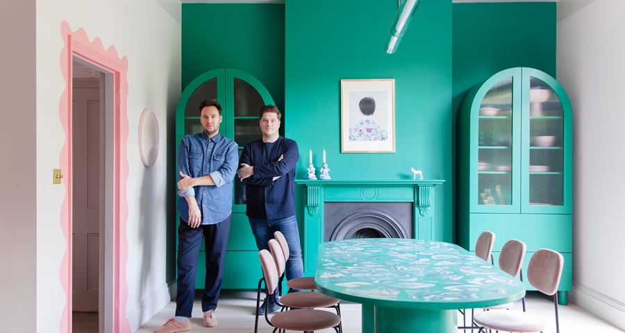
Jordan and Russell, creative duo behind 2LG Studio. | Image credit, Megan Taylor and Ben Sage
Q: What does home mean to you?
Home is a mini Dachshund, named Buckley. It wouldn't be the same without him. When we are all together, that is home.
Q: If you had to pick one design classic which you cannot live without, what would it be?
Impossible. We refuse to choose....oh. Ok. The crate series by Jasper Morrison for Establish and Sons and the Flos Snoopy Lamp (we are a duo so we can pick two, no?).
Q: What do you think makes good design?
Something that makes life better.
Q: Having both trained as actors, how did you forge a career in interior and product design?
We worked successfully as actors for nearly 10 years. But our minds and hearts were always active and inquisitive about the sets and the costumes and other things. When we met, we unlocked something in each other and began screen printing our own designs, then it grew and eventually took over our first love of acting. When you have trained and applied yourself at a high level in any creative field, it teaches you valuable lessons about what it takes and what brings you joy. We are still working as creatives, much the same as when we were actors, just with slightly different tools.
Q: How did you strike a balance between retaining some of your home's original features such as the pink interiors, whilst also keeping the look more modern and unique to you style?
It has been a journey, one that we have loved taking. It is true that our house was pink when we bought it, all the internal walls, candy pink, with deep green carpets. This was one of the things that made us fall for the house so we wanted to retain some of that in our redesign. It was also a house in flux as half of it had retained its original Victorian features and the other half had been changed in the late fifties and early sixties. We know this because of the kitchen design and the carpet upstairs and the stash of design magazines we found in the loft, all from 1959. This fascinated us, giving the house a lovely tension between two times and us a freedom to take it in a new direction. We have tried to honour the heritage of the house throughout, maintaining the fireplaces throughout and the ceiling roses and coving in the living room and hallway. But we also let ourselves play with different design periods, the 50s, the 80s and now, to create our own interpretation of the house.
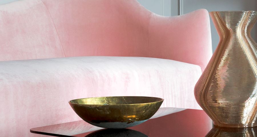
Image credit, Megan Taylor and Ben Sage
Q:You discovered scraps of wallpaper when you moved into your home, which inspired the first of many collaborations. Can you tell us more?
We love to collaborate, though it is overused a little as a concept. Perhaps because of our theatre training and previous careers on the stage, a very collaborative medium, we are naturally drawn to working with others and the exchange of different skill sets and ideas. When we first moved into our current property we intended from the outset for it to be a showcase property, a space for us to express ourselves and become inspired by. Finding inspiration in the property has been easy from the beginning and the wallpaper you mention was found in the humble setting of our downstairs loo. One of the first spaces we tackled once we had spent all of our initial budget on fixing the roof, re-stacking the chimneys, rewiring the house and putting in central heating. The downstairs toilet was the perfect contained little project to set us off on the creative path of redesigning the whole property. We found a scrap of ditsy floral wallpaper in there under layers of old paper and paint and it was totally ugly to us. It became a challenge that we could not resist. To take a retro floral and do something with it that would bring it into our new home. We had been working with Custhom Studio for a while, specifying their prints for our residential client projects, so we had already become friends and knew that we wanted to work with them so this was the perfect opportunity. It started out as an exploration of designing a bespoke print for the new space, but ended up as a three piece wallpaper and fabric collection that we showed with them for Ligne Roset at London Design Festival and New York Design week. It was an amazing start to what has now become our Design House project and is still available now to order.
Q: What is your favourite piece of work for a client?
This is such a hard one. We approach each client project so differently and love them in very different ways. It certainly was a thrilling moment when we took on a new client with a large Arts & Crafts property and showed them our Forest Hill Collection (the Custhom Studio Collaboration we talk about above) and they loved it. It felt so right for the architecture of their home. Like a new take on arts and crafts with hand finished gold leaf detail that is screen-printed and foiled by hand. We gave them a bespoke colourway for their entrance hall and also used it in their bedroom and gave them a complimentary rug in the floral ombre that is hand knotted from our rug collection that we designed for FloorStory. That felt like taking the small scrap of paper from our design house full circle. We also loved working with Smile plastics in a long renovation project to designed in South london. We created a bespoke dining table and bathroom basin vanity unit in their recycled plastic material and that bathroom in particular has become one of our favourite designs. This is on our website as our Granville Park project.
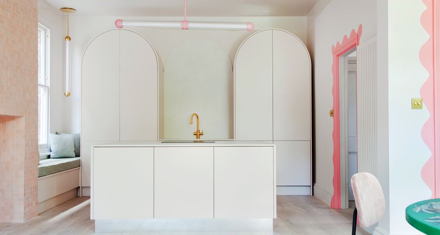
Image credit, Megan Taylor and Ben Sage
Q: Every room in your house has a unique element, how did you approach such a huge task? Can you take us through your creative process?
We take it one step at a time, so it doesn't feel like a huge task and we allow ourselves time to let spaces breath and bed in. We haven't applied time pressure to any particular part of the house and have let products have the time they need to develop before. This was a deliberate move as our previous home was a major renovation project and we tried to go at it so fast that some of the joy was lost. We tried to learn from that and this time allowed time so that rooms have become ready when they are ready and products have arrived when they arrive. That sounds much more free form than it is. Of course there is structure and there have been plans in place and an order of works, but we have given ourselves flexibility within that framework so that we could get each element right and spend time focusing on certain spaces rather than working on it all at the same time. Initially, we both created concepts, in both visual and story form, for all of the spaces, to get all of that initial excitement down on paper and free ourselves from it. Some elements have come from that initial creative splurge three and a half years ago, but other elements have changed massively. We designed the sofa two years ago and it has taken time to prototype and hone the colours and fabrics, but it was worth the wait.
Q: It is true you drew on inspiration from brutalist architecture and Jim Henson's labyrinth film to create the hand-drawn patter for the “felt-tip” wallpaper in your hallway?
Inspiration is a funny thing. Sometimes it is vividly clear and sometimes it is abstract memory. We are also very different people and our reference points are varied. Our design process is open, casting the net wide, before we hone in on the elements we love the most. This design found its first inspiration in Labyrinth, the film, it's true - specifically the Escher inspired climactic battle of wills between the leads in an incredible set of stairways and arches. Brutalism also excites us and we wanted to combine these elements in some way. They came together in the concrete labyrinth version of this design, also available, and the Felt tip version is a response to this. A softer more playful take on it that happily takes the structure from Brutalist cues but layers on the childish memory of Labyrinth with the use of felt tips. We love the way the ink becomes darker or softer as it crosses over and remains transparent in places. All that detail is still in the digital print version of the original hand drawn artwork we made.
Q: Your kitchen and dining area draws in many design elements from the worlds of art, design and film – including the Bloomsbury Group, Ettore Sottsass and Stanley Kubrick. What inspired you about these pioneering figures and how did you reflect their work in your designs?
We are both massive film and fashion lovers. We go to the theatre a lot too and spend time each year in Milan and at other design festivals around the world. That inspiration all goes somewhere and becomes part of who you are. If you are looking for a connection, then you are right in focusing on these figures as pioneering. Perhaps we are drawn to mavericks, people who break the mould and do their own thing. There is a tension, a friction surrounding these types of creatives. That excites us. Whenever we hit on an idea that feels naughty we can't resist. The hand-painted door frames in our kitchen and dining space, for example, were a late addition. At that point in the build (we had to knock out two walls and put steels in) we had been through it and needed to let loose and react to the space in a freestyle way because it was so exciting to get that far but also exhausting and frustrating. The door frames were a mini rebellion against our own design. A way of reclaiming the new space with an instinctive twist. We like to call it lipstick for doors. In the same way Drag artists have been challenging perceptions and expressing a loud and proud attitude, we wanted a moment of that. Yes there is a Sottsass reference, he is undoubtedly a hero of ours. Yes we were reading about the Bloomsbury group at the time and that no doubt gave us some confidence to pick up a brush. But ultimately it was a bit of fun at the end of a hard few weeks of dust and noise. As for Kubrick, well he was in our initial creative splurge when we imagined the kitchen three and a half years ago. We wanted to disrupt the Victorian setting in the same way Kubrick did with that incredible dreamlike set with a lit floor in Space Odyssey. So the lighting we designed for our kitchen, a new collection called Capsule for Cameron Design House, is that disruptive element. Retro futurism if you like. A sexy new strip light that has no place in a Victorian house, but feels so right here.
Image credit, Megan Taylor and Ben Sage
Q: Has your home fulfilled your initial hopes?
A massive yes, but it is not finished yet. We still have several spaces that remain untouched and big plans. It has had some disappointments and compromises and challenges along the way, but it still manages to put a big smile on our faces everyday so that is all we could want
Q: Are there any dos and dont's to interior design? You've mentioned that copper with pink is cliché.
Haha, did we say that? Well, copper does feel a little over done, it's true, but perhaps that is just because it was at the forefront of the new social media revolution in design and as a result got massively overexposed. As for Dos and Don'ts. Do listen to the architecture, chances are it has something wonderful to say, and if it doesn't then you can fill it with your soul instead. Don't follow trends and don't be afraid. Trends are useful to keep afloat, but they must never steer the ship and other people's ideas must never stop you from doing you.
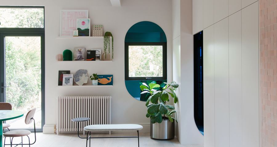
Image credit, Megan Taylor and Ben Sage
Q: Name three things that will shape the future of interior design?
Veganism. Sustainability. Brexit. Instagram. 2LG Studio, of course! That's five, but we like to give extra.
Q: What's next on your agenda?
We are about to write our first book, we have an exciting new bathroom project for CP Hart in Waterloo, more design work for clients and for our own Design House. But we are also setting our sights on commercial projects. We would love to design a restaurant or bar or shop or hotel. Why let ourselves be put in a box. We are ready for the challenge.
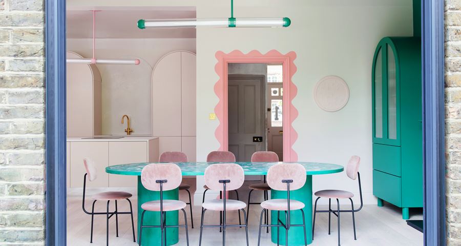
Image credit, Megan Taylor and Ben Sage
Related exhibition