Redesigning The Guardian newspaper
Q&A with Alex Breuer
Coinciding with the free pop-up display exploring the design process behind The Guardian’s new tabloid format, the Design Museum speaks to Alex Breuer, Executive Creative Director at The Guardian about the paper's redesign.
Q:
What was the initial motivation for your design?
The need to change to tabloid format for the paper was driven by the opportunity to reduce both logistical and production costs.
The motivation behind the approach to the redesign was to build new editorial narratives and a design language inspired by the redefined principles of The Guardian as outlined in an essay by Editor-in-Chief Katharine Viner. Embodying The Guardian’s mission of providing quality, trusted and progressive journalism. The reach of the project needed to be beyond the newspaper and across all our digital platforms and Brand.
Q:
What are your guiding principles behind the redesign?
Two of the key principles behind the evolution of the new design were readability and navigability. This traversed both print and digital. For the newspaper we had to overcome the challenge of changing the page size and developing a new structure for the newspaper that solved the problem of disaggregation that emerged with the switch to tabloid. In turn, for the digital products we wanted to evolve the design language to better help people discover and engage with the rich diversity of Guardian journalism. We knew we had to evolve the navigability on our digital platforms from one that reflected our internal structure to one that reflects the way our readers use the site and app.
Q:
The main theme of your design is “space for ideas”. Moving forward, how will this new aesthetic link with your reporting style?
There are a few key examples of how the structure and aesthetic marry with the reporting style. For example, the creation of the journal section at the heart of the paper, with its distinct look and pace for read for opinion analysis and a whole new series of explanatory and exploratory articles. Also “the view from Europe”, the briefing and the alternatives are other good examples. In addition, across all platforms, the drive to bring greater meaning and insight through our reporting is embodied in a whole series of analysis and ‘explainer’ formats. New visual and literary narratives that nestle alongside traditional reporting.
Q:
What was the first conversation you had with your team? How did the design develop from there?
The first conversations were driven by the brief from the Editor-in-chief, to challenge all preconceptions. To really explore what The Guardian in print means for our readers and to build on all we had learnt about how they engage with our digital platforms. This freedom was invigorating. The early weeks were full of playful experimentation with form and format. We deconstructed everything. We had to, the change to tabloid meant technically the paper was printed and complied in a different way from the Berliner. One of the most fascinating and key challenges was managing the evolution of the design across print and digital concurrently. Evolving and shaping the colour language, typography and brand elements so they worked everywhere required a great deal of agility. But the design team at The Guardian is already a hugely collaborative one across print and digital and so there is a great understanding of how to get the best where platforms interface.
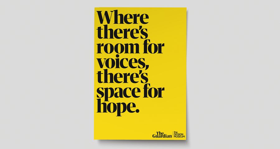
Image: Courtesy of The Guardian
Q:
Take us through your thought process and design thinking behind the new masthead, colour palette and typeface?
The evolution of the colour language was the continuation of a piece of work that had already begun on the website and apps. We’d had some success in early testing on digital platforms, redefining the top level navigation structure around five key pillars: News, Opinion, Sport, Lifestyle and Culture. Using these pillars had led to simpler paths for content discovery and a clearer understanding to our new readers of the core framing of our journalism. It also simplified what had become a very complex navigation that reflected the internal structure of the newsroom. The pillars also felt in harmony with the structure of the main body of the newspaper. It seemed a simple step to make them the basis for defining the structure of both analog and digital. And this led us to shift our core colour language away from journalistic tone (features, comment, live analysis etc) to a simple five colour system marking each of the core five pillars.
And lastly, the masthead or logo. This became an implicit part of the redesign and needed to reflect the vision set out by Katharine Viner in her essay. The previous logo was created at a very different time, there was no iphone, the digital presence of news brands was still very much supplementary to their heritage platforms. The previous masthead was crafted for the newspaper and then subsequently applied to other platforms. At the time of its creation the switch to all lowercase was a very powerful indicator of the different space The Guardian occupied in the newsprint market. The geopolitics at the time was positioned very differently from what it is now. The Blair government was just beginning its third term and none of the themes that now dominate the news agenda or its delivery had materialised. In the intervening years the latter has changed dramatically and in tandem The Guardian has grown as a global news brand exponentially.
The type form of the masthead was an evolution from a new high contrast version Guardian Headline. This was drawn for use for titling sections throughout the newspaper. The font was created by Commercial types who have been our partners for key typographic changes on the project. The final masthead for the paper was an evolution from the titling front that was created by our in-house design team.
Q:
What three words would you use to describe your new brand identity?
I would say it is urgent, inclusive and bold
Q:
In an increasingly digital world, how can newspaper design stay contemporary?
Whilst some of its place in the daily news cycle has been superseded by the immediacy of digital, a newspaper remains the most easily readable, manageable and navigable experience for narrative literary and visual journalism. I think the key is always understanding what role a newspaper plays in people’s lives.
A newspaper is finite; an individual edition doesn’t change from one minute to the next. Digital platforms can bring a little of the anxiety of starting to watch a live tv program halfway through, you can’t always make sense of a beginning and you are unsure of an endpoint. A newspaper doesn’t have that sense of missing or unknowing. It is easily returned to and kept. It is essential to value these in the design but more importantly in the editing and commissioning of the stories. We have tried to embody this in the creation of more richly presented articles with explanatory panels, the creation of the reflective journal section and the redefining of the structure of the Saturday paper into a collation of truly useful and collectable sections. Whilst digital in the ‘now’ has a competitive edge in terms of speed, it lacks the permanence and resolve of print.
Q:
In what way do you think the internet has changed the way that we consume information?
The internet has given us information at a speed, volume and in a form we could never have imagined, and probably only a few of us would ever have sought. It has democratised the creation and consumption of information. It has given people a way to both challenge our preconceptions with the increased availability of a breadth of perspectives but sadly to also reinforce and share prejudices in profoundly sinister ways. The speed of availability of information is in danger of having pre-eminence over its value and meaning. I think this brings with it a strange mix of liberation and anxiety in the ways we consume information.
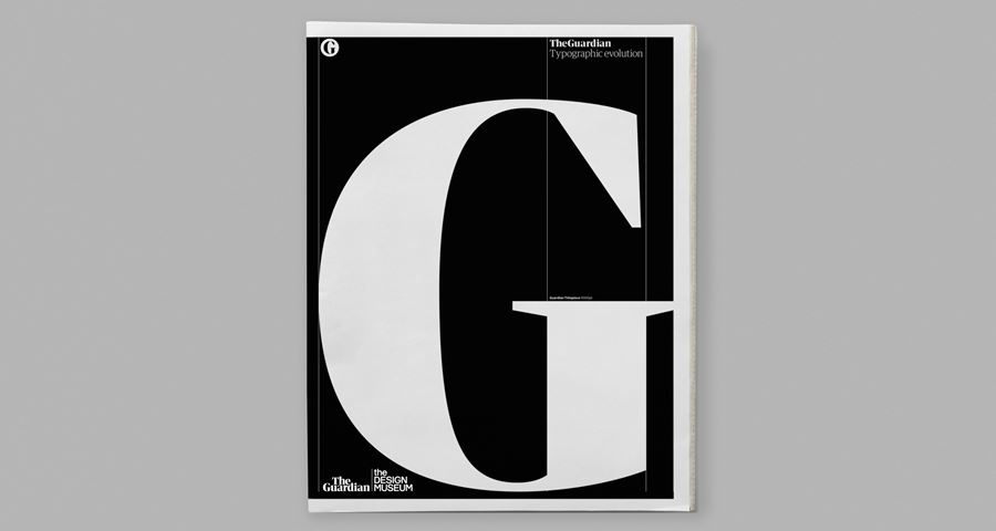
Image: Courtesy of The Guardian
Q:
What message do you want to convey to Guardian readers with the new design?
I want them to be reassured that change in this case has not devalued or diluted any of the values of the Guardian and its journalism that they come to us for. And that in this change we have tried to understand what role the Guardian plays in their lives and that we have, through the changes we have made, brought greater meaning and delight to the range of voices and experiences that are embodied in the brand.
Q:
Do you think the design overhaul has fulfilled your initial hopes set out in the Guardian’s Digital First Strategy, which you led back in 2015?
I think we have gone further in this latest set of changes than we did back in 2015. We have greater understanding of how our readers enjoy what we do and when through research and data. We have matured to reflect this understanding and been even more open to challenge approaches and structures defined by legacy. Our strategy has always been to be dynamic, reactive but also innovative. I feel this latest step is true to that.
Q:
If you had one piece of advice for a young designer, what would it be?
Learn to communicate with precision, clarity, conciseness and enthusiasm the ideas and value of the design you have created to those that will use it. Understand that whilst success in aesthetic can have a strength in drawing warmth and emotion, it is more important to show that the value of what you have created has been defined by a keen empathetic understanding of the problem you have been asked to solve.
Oh, and read “Art as Experience’ By John Dewey. As Paul Rand said ‘You aren’t an educated designer unless you have read this’
Alex Breuer, Executive Creative Director
alex.breuer@theguardian.com
Instagram: ajbreuer
Twitter: @ajbreuer
Find out more
Shop