David Adjaye: Making Memory
Q&A with David Reinfurt
To mark the David Adjaye: Making Memory exhibition, the Design Museum speaks to graphic designer, David Reinfurt about his Speech-to-Text typeface for Sir David’s proposed Martin Luther King and Coretta Scott King Memorial in Boston. The typography visualises the sonic qualities of King’s famous speeches onto the stone face of the structure.
Q: How did your collaboration with Sir David Adjaye come about?
I was invited by Adam Pendleton to join a team to create a proposal for a memorial to Coretta Scott King and Martin Luther King on the Boston Common. Sir David Adjaye was already the central part of that team. Specifically, I was invited to propose a custom font to typeset all the words on site. That is pretty much what I did, however the idea was developed together with the team and my role inevitably overlapped with the rest of the project. It was a very rewarding collaboration.
Q: What was the relevance/importance of Boston Common to the Kings?
The specific site in the Boston Common that we chose on the northeast corner is across the street from the Massachusetts Statehouse, next to an existing memorial to the 54th Regiment armory and across the street from a statue of John F. Kennedy, also instrumental in the struggle for civil rights in the United States.
Q: How does your design respond to the site on the Boston Common?
This site that we chose in the Boston Common is hallowed ground. It is where contemporary protests are held and where groups have gathered in public for 200 years. For example, in 1965, Dr. Martin Luther King delivered a speech at the site, calling on the city to live up to its legacy of social justice.
Q: How did you combine the multiple disciplines of your team into your work – art by Adam Pendleton, architecture by Sir David and the curatorial and gallery expertise of Future Pace?
It was pretty fluid, however technical tasks were easily divided among the various team members. Adam Pendleton was originally invited for the project and his studio served as the organizational and conceptual center of our proposal. David Adjaye Associates produced all of the architectural design and assembled the proposal, working together with Future/Pace to render our pitch relevant to the city of Boston.
Q: Oratory isn’t something easily captured by letterforms on a page – how did you overcome the obstacles of this design proposal?
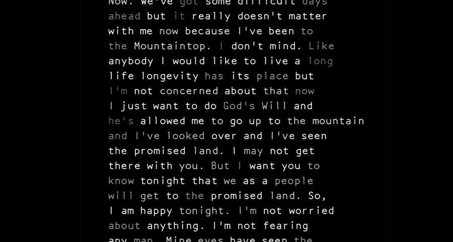
Exactly. The competition guidelines emphasized that this memorial should be a “call to action.” So an immediate idea was that all of the text on the site should come directly from the speeches of these two civil rights leaders. The words they spoke in public, articulately, passionately, had tremendous consequences. The civil rights movement in the United States was facilitated by the moral and compelling words performed in public. We decided in the beginning, based on this idea, that the text engraved on the site would always include considerable context. There would never be isolated quotations lifted from their original time, place, and site. Instead we would have long texts, even digressive texts, which not only illustrate the moral case that was being made but also give some understanding of the manner in which they were delivered. We thought that by including longer excepts, then it might immediately also feel more like someone speaking.
Speech-to-Text is the name of the custom font software that we developed for this project. The software takes an audio file as an input, converts the spoken audio to written text using Google Cloud’s speech to text recognition platform. The custom font software then takes this information and displays the words on screen over time, matching the rhythm and cadence of the spoken voice. As well, on the site, all of the words are engraved into black marble where the depth of the word matches the volume of the spoken text. This uneven typographic texture then registers the presence of a person speaking.
Q: Can you tell us more about the Google Cloud software you used to develop the Speech-to-Text?
This Google software uses machine learning models to transcribe spoken words to written text. The model is always getting more sophisticated, and what is possible now was not possible ten years ago. This software is so rapidly evolving, that this typeface project would have been unrealistic even only five years ago.
Q: Why did you decide to go with the typeface, Artisan, to create your characters?
This typeface, Artisan, was originally designed for the IBM Selectric typewriter. The IBM Selectric was a popular technology at the time that Dr. Martin Luther King made his compelling arguments in public as speeches. Those would've been delivered from typewritten notes, possibly tapped out on an IBM Selectric. Either way, it was a new technology of the time and registers the middle of the 1960s in a convincing way. Plus this mono-spaced san serif typeface had never convincingly been digitized.
Q: How do you intend to display and encourage people to interact with the typeface on the memorial?
At the site of the memorial, all the words are cut into the black marble and presented at a fairly large, monumental scale. The idea is that the speeches envelop the public. As well, two electronic monitors on the site display a set of speeches by Coretta Scott King and Dr. Martin Luther King. Finally, there is also a mobile app which streams speeches to your phone as you wander around the physical site.
Q: Memorials are meant to reflect history, memory and record human lives – how did your design also meet the brief of looking towards the future?
We departed from the idea that was clearly described in the brief to make this memorial not only a record of the past but also a call to action in the present and the future. Therefore, we chose to typeset the spoken words directly. Our hope was that the quality of this transcribed speech might feel as urgent now as it did then. This work is not nowhere near over.
Q: What’s the one thing you’d like people to remember about your design when they leave the David Adjaye: Making Memory exhibition?
I would like them to think about the difference between written text and spoken text, and to consider how the words uttered at a certain place in time can act like a lever, prying open situations that might've previously felt stuck. As well, I hope that anyone looking at this immediately registers the moral urgency of this material right now.
Q: If you had one piece of advice for a young graphic designer starting out, what would it be?
Follow your instincts, find good people to work with, and stay committed to the same ideas as you develop your practice. Eventually patience and persistence are rewarded and opportunities to make the graphic design you want to make will appear.
Related exhibition