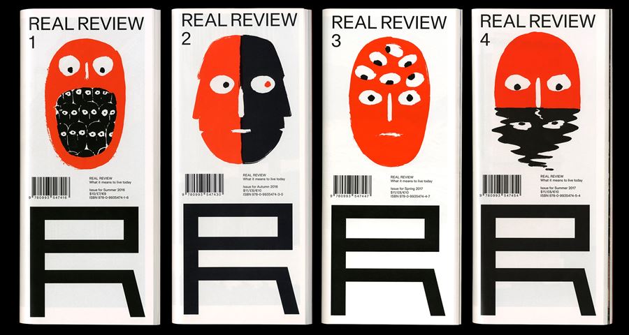
Real Review Beazley Designs of the Year : Graphics Nominee
Q&A with Jack Self (Real Foundation) and Rory McGrath (OK-RM)
In this collection of interviews, some of this year's Beazley Designs of the Year nominees share their design stories, challenges and aspirations with the Design Museum.

©2017 Real Review
What was the initial motivation for your design?
We are trying to understand the contemporary. Our tagline – “what it means to live today” – concerns an effort to analyse the present by reaching deep into the past, then making propositions about the future. This is the essence of the review as a format and a methodology. The idea of looking backwards to look forwards applies not just to the content, but also the design and production of the magazine itself. Real Review has always been an exercise in minimums and constraint, on many levels. The structure and specifications of the magazine were developed with exacting attention, and there is an extreme economy to our operations: we understand costs per square metre, restrictions on postage formats, the possibilities of specific print processes. Page count, paper thickness, weight, words per column… these can all be optimised to maximise our potential and agency. Developing the magazine with this rationale allows for a rapid editing and layout process, which results in more time spent on commissioning and art direction.
What was the first conversation you had with your team? How did the design develop from there?
On day one, the REAL foundation, a London-based cultural institute and architectural firm, approached design studio OK-RM and asked them to design Real Review, which was imagined as an architectural review magazine. The stated aim was to use the review format as a way to build a positive discourse, to explore the politics of space, as well as find ways to analyse and intervene in conditions where injustices and inequalities are present – be they gender, wealth, class, race or civic. That first discussion was primarily pragmatic: how can we produce a professional and engaging magazine on a small budget, with the most effective use of our time, and with a view to building financial stability rapidly. But by day two, the scope had already evolved significantly, expanding the editorial lens from architecture to the entire world of contemporary culture. All these factors mean that Real Review requires an intense form of collaborative design. We have had to invent new ways of working to coordinate and cross between editorial, art direction, design, production, etc. Such an intense condition made it kind of inevitable that the magazine would quickly become a partnership between REAL and OK-RM, which it is.
What obstacles did you face whilst working on your project?
Our focus with Real Review is principally to uphold the structure and consistencies of the magazine, while continuing to explore the possibilities such conditions offer us. There are no themes to Real Review – the format of the review itself is our theme. However, each issue is centred around a “current mood”. This mood is our attempt to track the zeitgeist on a quarterly basis, and have previously included things like “historical déjà vu” (#2, around the time of Brexit and Trump), “global civil war” (#3, as the world’s political and economic stability has crumbled) and “systemic doubt” (#5, the current issue, which responds to our current social anxieties). Balancing the mood, editorial and aesthetic principles of the publication is a beautiful problem. A more pressing ambition is how to achieve sustainability for the future. This means paying close attention to questions of costs, supply chain distribution, and the overall economic conditions of the magazine. But with every problem comes the potential for exciting solutions. We are currently exploring new possibilities for the dissemination and culture of the publication, and we will be releasing more information about this agenda in the coming months.

©2017 Real Review
What is the latest news regarding your project? Has it fulfilled your initial hopes?
Real Review continues to grow in audience and global reach, although we still face many of the difficulties mentioned above to do with costs and logistics. The biggest shift since Real Review was founded is occurring right now, as we move from a subscription-first model to a membership-first model. In essence, this is intended to transform regular readers into a community. We also want to use membership as a way to expand our offering to readers and to explore new ways of pursuing our cultural agenda. To be clear, this isn’t a coded message for the sudden commercialisation of Real Review. We are not interested in swag, branded events, or product placement. We carry no adverts or publicity and this will never change. We will always rely on the support of our readers. There is a kind of cliché in independent publishing where an entity that has achieved some success then tries to over-capitalise on their brand (often in quite cynical or disingenuous ways). We have no interest in that route, which would completely contradict our quest for autonomy. Rather, we are trying to find new forms of generosity for those people upon whom our success depends.
What’s the one thing you’d like people to remember about your design when they leave the exhibition?
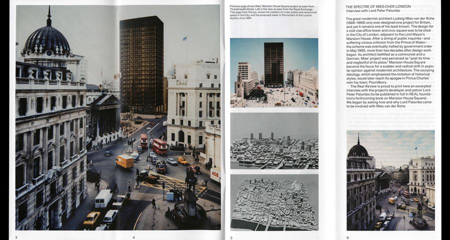
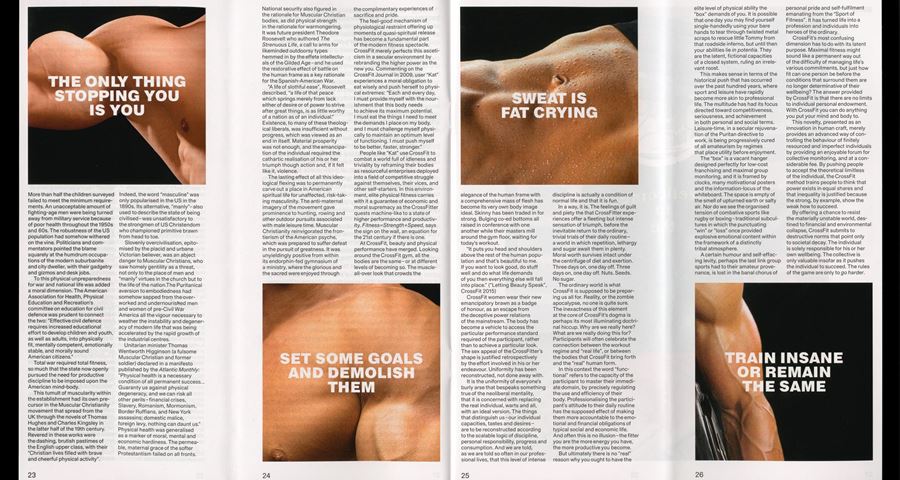
With an explosion of independent magazines in the last few years, and a continued decline of traditional print media, it can sometimes feel like there is no space for doing something new, or different, or of making an impact with your message and design. What we hope people see in Real Review is its attempts to radically rethink the basic form of the printed magazine. For example, Real Review is the first magazine to use the vertical fold as a design element. The creasing machine used to put horizontal folds in newspapers every day for more than a century has simply never had anyone turn the sheets 90 degrees. What that has allowed, amongst other things, is the creation of a page that has a physical space. Moves like this demonstrate that you can always find newness and innovation, even within the banal, ordinary and exhausted. We are great believers that there is always hope.
What does it mean to you to be nominated for this year’s Beazley Designs of the Year?
This is one of the most prestigious design awards in the world. It almost goes without saying that it is a tremendous honour to be nominated. But while we are very proud, it is also extremely humbling to be included amongst so many excellent, powerful, forward-thinking and socially impactful designs.
If you had one piece of advice to a young designer, what would it be?
Take stock of your discipline as it stands, survey the field, consider your position and agency. Then, enter the discourse in your own way.

©2017 Real Review