Beazley Designs of the Year
Q&A with David Sheldon-Hicks, founder of Territory Studio
To mark the Beazley Designs of the Year exhibition, the Design Museum speaks to David Sheldon-Hicks, the founder of Territory Studio, which created the graphic interface for the future-defining film, Blade Runner 2049. Find out more about this year’s digital nominee in this Q&A about the creative studio's design story and inspiration.
Q: Congratulations on being nominated for this year’s Beazley Designs of the Year, what does it mean to you to be put up for this award?
It's an incredible privilege to be nominated. We never expected that our film work would be put up for an award like this and it’s truly humbling to see our fictional technology screens for Blade Runner 2049 next to real world projects across the full range of design disciplines.
Q: Despite your expertise in design with a compelling future-facing aesthetic, you decided to modify your approach away from computer graphics to more tangible technologies for Blade Runner 2049. The outcome was an interface that was utterly foreign yet oddly familiar too. What was the reason behind this design decision?
As creatives, many with an art school and graphic design background, we often start projects with a blank page, pens and pencils. The difference for this project was that director Denis Villeneuve was so enthusiastic about originality beyond digital conventions that he encouraged experimentation, and we were able to completely focus on that during much of the concept and development stage of the project. When it came to pull together all those experimental elements, that’s when we turned to our CG toolkit, and combined those organic and abstract, physical and mechanical elements with interface design.
Q: Did you draw on any well-known technologies or design classics to inspire the look and feel of your graphic interface?
Because all our screens had to support the narrative, contribute to the world of 2049 and tie into specific points in the script and action, we had some notions of what the technology in a given scene needed to do, and that led our ideas. To get a sense of physicality, our references pre-dated digital and electronic, and were primarily mid century mechanical technology and systems.
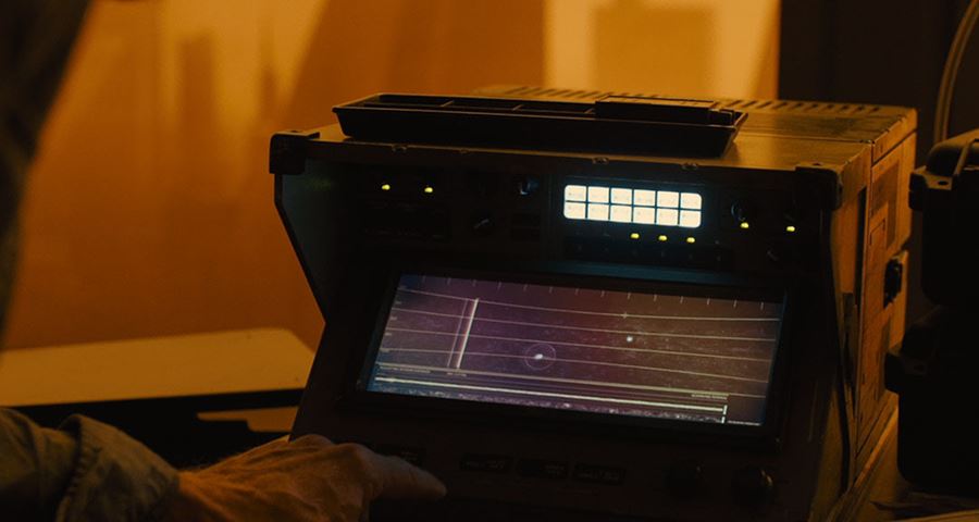
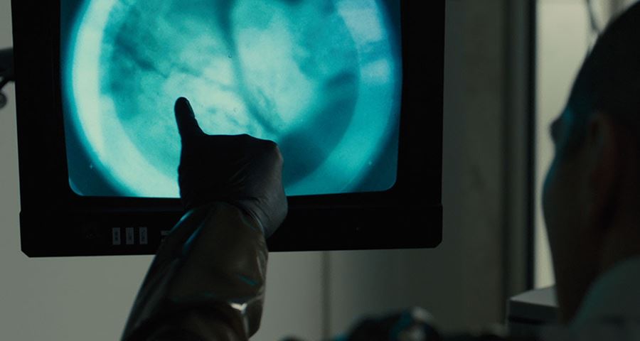
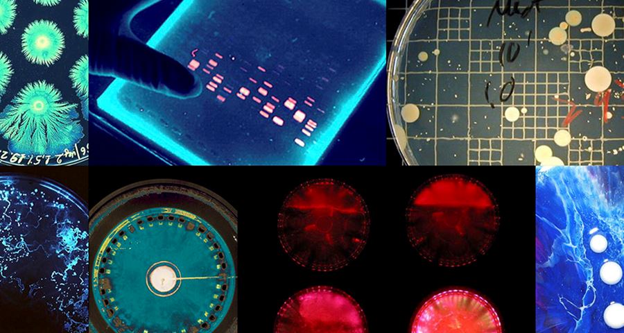
For example, we knew that the morgue scene required a sophisticated bone scanning device, but given the alternative technological trajectory of the story, we had to think of an alternative to digital scanning technology. Knowing that Villeneuve wanted organic, physical mechanical references, we went out to our local charity and vintage shops and found old school microscopes and differnet types of optical lenses. Using these together with bone from the local butcher, we played with macrophotography and optics, and devised a hybrid system of old and new, that shunted optical lenses into place as the machine scanned the bone at varying magnification.
Similarly, we knew that the DNA archive was a large machine of some type that K would sit in front of. So we researched old card archives, rolodex systems and microfiche and combined elements of all into a system with an interface that felt analogue.
While obsolete, these systems are part of our cultural heritage – we’re familiar with them even if we’ve never used them ourselves, and that establishes an emotional and intellectual connection in the audience that means they can relate to the technology, even if it feels very different to what we use today.
Q: How did you create that gritty and grainy look for 2049’s interfaces?
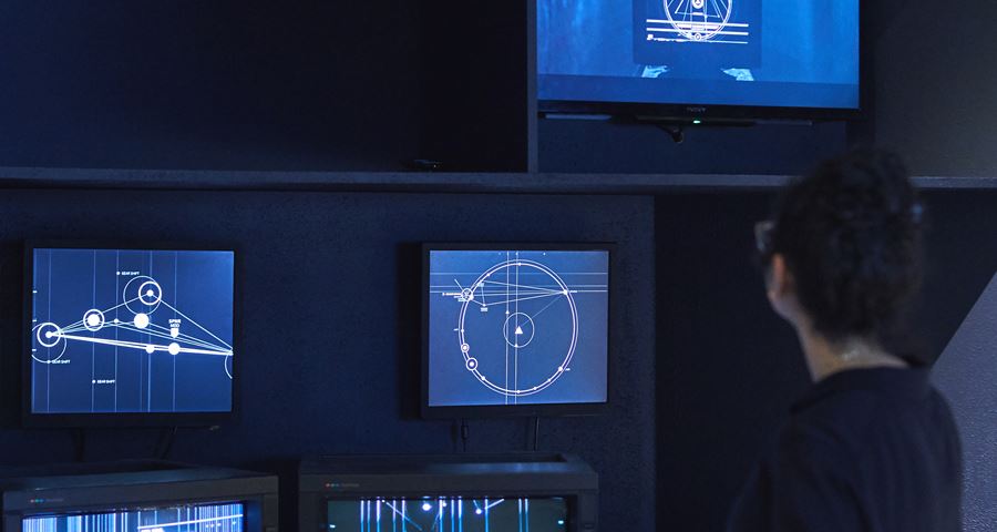
Once we pulled all our research together and had approved concepts, we layered them in CG, and applied the appropriate ‘wear and tear’ for a specific interface. So K’s spinner was an old model with glitchy technology that reflected his low status as a replicant and blade runner. We used CRT screens and added fading, warping and grain to the images to create the illusion of age and distortion.
Q: Was it a challenge to retain a sense of nostalgia and be true to the fans who adored the original 1982 film by Ridley Scott, whilst also trying to be relevant in 2017? How did you balance elements from the past with your more updated ideas in the latest film?
That was challenging. The director and Paul Inglis, the supervising art director who was our day to day contact, were very clear that this was a new world, 30 years on from the original, so the environment and technology had to reflect that evolution, in the same way that the technology of our own world looks very different from that of 30 years ago.
At the same time it was important that 2049 felt like a natural evolution from the original, so we drew some parallels, largely in the physicality of the tech, in some of the colour palettes, in the screen types to suggest that while the technology had evolved it also had some regressive qualities to it, due to the blackout event.
Q: You mentioned before that the concept behind Blade Runner 2049 was “technology being reset” – can you explain this further?
One of the story arcs is the impact of the ‘blackout’ event that wiped all stored information. This is really only alluded to in one scene, but narratively, it means that the search for truth is much more difficult than it would be if all data on people and replicants had been stored and was available to search. It means more detective work, uncertainty and dramatic tension. For our brief, it meant that digital technology as we know, understand and use it today, was not to inform the interface design.
Q: Your visuals explore cultural and political discussions about how society might utilise technology now and in the future. How did you reflect these questions in your work?
Film projects are first and foremost about telling a story. The subtexts that run through 2049 include comments about social status, a political order, cultural biases and a minority fighting for equality.
Central to our creative approach is that technology is a lens through which story unfolds. This means that our technology interfaces must always support the story– the script, action and performance and the director’s vision for the world he is building. On Blade Runner 2049, every screen was designed to support a specific plot point.
But more than that, technology interfaces can be a subtle extension of character and environment. To feel authentic, our screens have to tap into subtexts and character – much like costume design does in terms of what an individual’s clothing or an organisations uniform says about them.
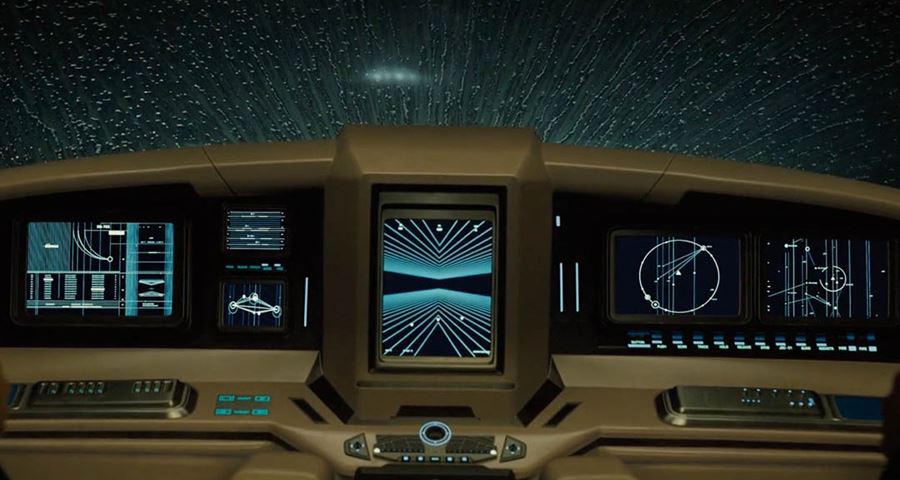
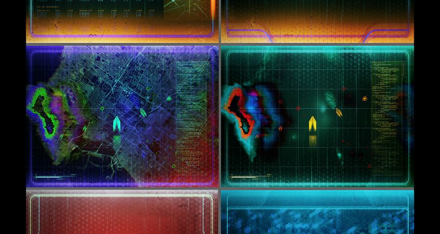
We designed a visual language to support the key sets and characters in the film. The LAPD’s technology interfaces to be utilitarian, with a neutral colour palette, and militaristic overtones to suggest the authoritarian nature of the organisation and its purpose. It does have organic elements to it, but the focus of our work was to convey that this sort of brutal power structure has been put in place to control the ragtag population left on Earth. But our approach to the Wallace Corp organisation was different; here we wanted to reflect the power, wealth, obsessive nature and cold brilliance of Wallace himself and adopted a pure geometric and monochromatic UI that was completely devoid of humanity. Minimal to the point of being esoteric, these are the only screens that suggest digital capability and that’s due to the Wallace Corp’s wealth and off-world status. In contrast to both LAPD and Wallsce Corp, K’s technology as seen in the spinner vehicle is overwhelmingly human with warm colour tones, and all the imperfections of age and defunct technology – grainy, glitch, colour warping, physical and tactile.
Within these languages and screens, we are asked to support and help explain specific plot points with visual elements. The objective is always to support the story and action and performance and when the tacit elements are right, the screens feel authentic and seamless within the context.
Q: Often Sci-fi can be criticised for looking too cliché, what inspirations did you draw on from which allowed you to be more playful with your palette and impressionistic with your UI design? Is it true sea life and even opera were explored?
Depending on the brief and type of film, we can be more or less experimental with our approach. When working on The Martian for example, we had to be faithful to the science and NASA’s real world technology systems. On science fiction and fantasy films, the briefs are more open and tend to push for originality. And then we do turn to non-film references as a way to avoid graphic genre conventions. So yes, marine life, architecture, sculpture, modern and abstract art and dance, music – for a motion designer these can all be amazing sources of inspiration for colour, form and movement. Blade Runner 2049 offered a unique opportunity to take that experimental approach and push it as far as we could within the context of the brief, but again, research was appropriate to Villeneuve’s direction and preference for organic, abstract, physical, mechanical qualities.
Q: What was it like working with someone as visual as Villeneuve? Was it easy relaying your vision with the director?
Denis Villeneuve was a pleasure to work with – collaborative and respectful of everyone’s talents, with a clear understanding of how we could contribute to the story and world, and articulate in expressing what he wanted from us. Our initial conversations were with Denis, and he was very clear about what he was looking for. We shared initial concepts and his feedback was equally clear about what he liked and wanted us to pursue. But our day to day contact was Paul Inglis, Supervising Art Director who was completely attuned to Denis and Production Designer Dennis Gassner’s vision.
Q: What’s the one thing you’d like people to remember about your nomination when they leave the Beazley Designs of the Year exhibition?
We hope that visitors will remember that technology interfaces for film give creatives, and audiences, the opportunity to speculate about and explore how technology, and our interaction and relationship to it might evolve. In that sense, fictional technologies seen in science fiction and fantasy can inspire, influence and even inform future technologies.
Q: And finally, if you had one piece of advice for a young creative who would like to get into your field, what would it be?
Love what you do, never stop learning and be curious and open to experimentation. If you want to work with motion graphics for film, then pay attention to story and how your work can support it. And finally, be nice to people!
Related exhibition