Past exhibition 2007
Into the Archive - Revisiting Designs of the Year, 2007
The Design Museum goes back thirteen years to the launch of its very first Designs of the Year exhibition. Do you remember who won?
In 2017, Design Museum director Deyan Sudjic confessed to a ‘howling error', the iPhone was not Design of the Year in the year that the Design Museum’s annual awards show was launched.
Instead, the top prize went to the XO-1 laptop, a low-cost, energy-efficient machine designed for charity One Laptop Per Child for use across developing countries. Designed by Yves Béhar of Fuseproject, it had all the features of an ordinary laptop but cost only $100 instead of $1000, was rugged enough for use anywhere in the world, and had Wi-fi antennae that resembled rabbit ears.
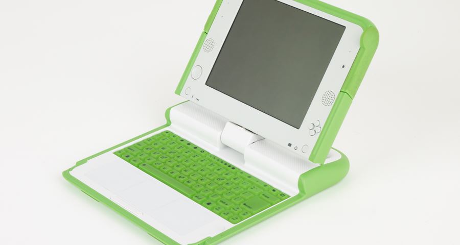
The XO-1 laptop, designed by Yves Béhar of Fuseproject for One Laptop Per Child
The XO-1 laptop was a bold idea, but as time went by, it was clear that the iPhone would have had a far bigger global impact – and in ways that were not immediately apparent in 2007.
This draws attention to one of the apparent contradictions of the Designs of the Year exhibition – namely, the seemingly overwhelming challenge of picking a single winner from 100 nominations drawn from the fields of architecture, fashion, product, graphic, transport and digital design. How should the jury balance the merits of a project that had genuine aims of improving the lives of millions across the developing world against the most innovative smartphone ever seen?
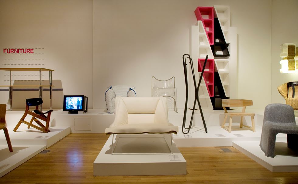
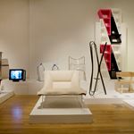
A view of the Furniture nominations
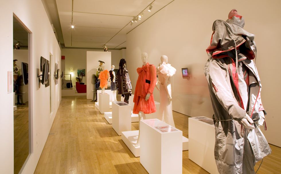
The Fashion section
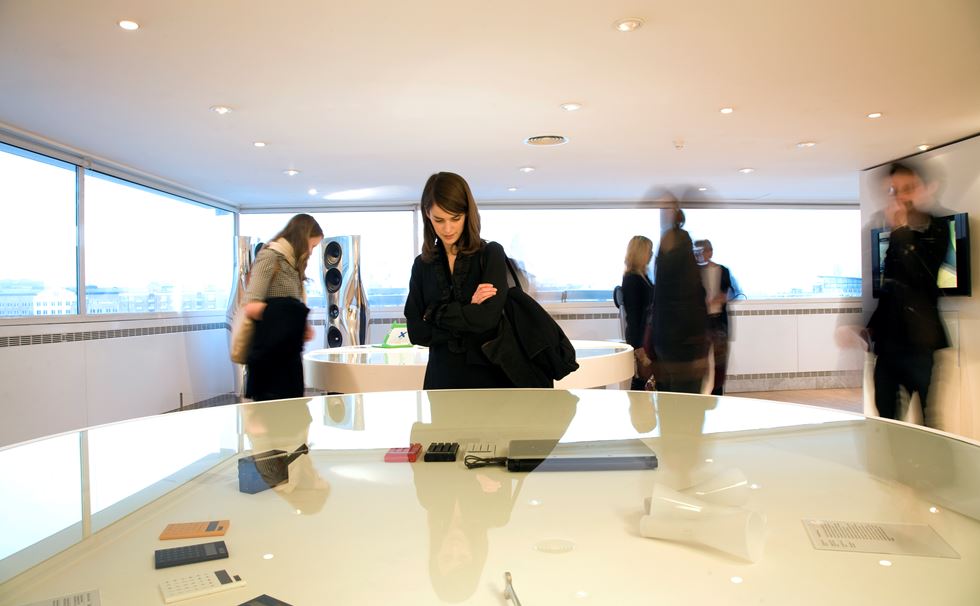
Part of the Product gallery

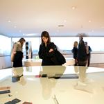
However, to see the Designs of the Year show as a competition alone is to miss the point. The show’s real attraction is as an annual snapshot of the world as seen through the lens of the designers, commentators and critics – or, at least, how they would wish it to be. For journalist and Dezeen founder Marcus Fairs, who sat on the jury in 2007, the choice of the XO-1 laptop was made in part because it ‘genuinely felt like a potential game-changer’, and, although it didn’t fulfil its promise, it ‘at least symbolised a desire to change’.

Designer Yves Béhar of Fuseproject holding the XO-1 laptop during the awards ceremony
For today’s post, we thought we’d look at the very first Designs of the Year exhibition and to see which projects catch the eye today.
What’s immediately clear is that 2007 was a more innocent time. The credit crunch and the decade of austerity that it precipitated was yet to hit. Perhaps unsurprisingly for a world that felt flush with money, the shortlist featured a number of projects for which bigger was most certainly best. The winner of the Architecture category was the spectacular Beijing National Stadium, designed by Herzog and de Meuron for the 2008 Olympic Games. Nicknamed the ‘Bird’s Nest’, this was the most striking of a series of architectural projects designed for the Olympics all of which were intended to signal China’s emergence as a political and economic superpower. Another nomination was the Airbus A380, which remains the world’s biggest passenger aircraft even today.
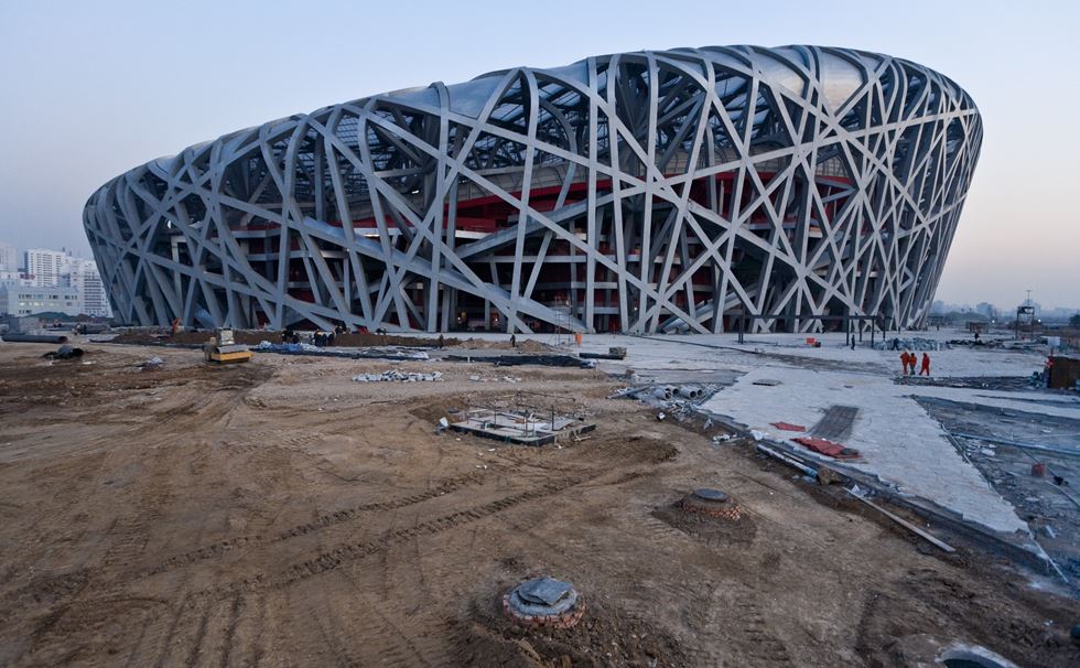
Herzog and de Meuron’s Beijing National Stadium nearing completion in 2007
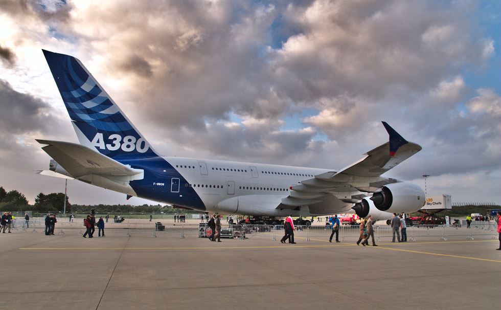
A prototype Airbus A380 at Hamburg Airport in 2007
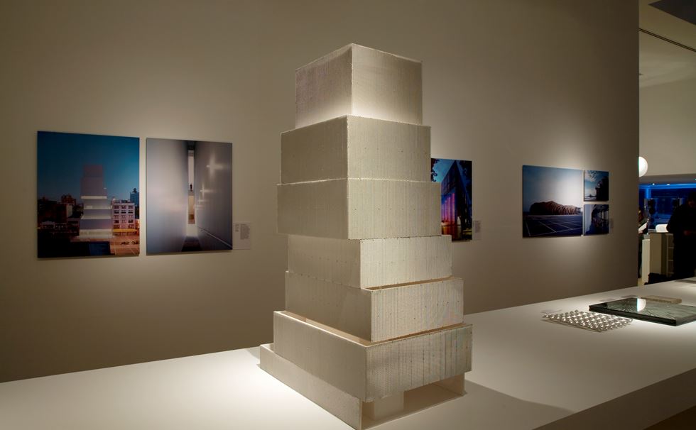
The model for SANAA’s New Museum in the Architecture gallery


Looking through the list, there’s also a sense of design as belonging to the realm of refined objects – such as Yves Saint Laurent’s Downtown Tote, the must-have celebrity bag of 2007 or Ross Lovegrove’s limited-edition speakers, made from 6ft tall blocks of solid aluminium that took a whole week to machine. Elsewhere, it’s clear that the format of the show was still finding its feet – some of the nominators put up their own projects forward for consideration, a convention that would not happen today!
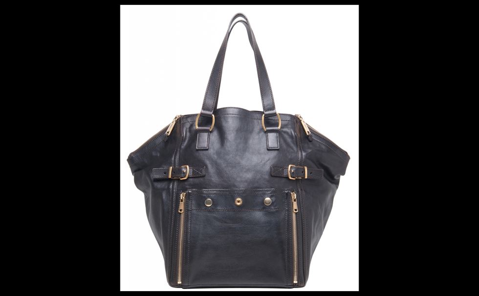
Yves Saint Laurent’s Downtown Tote, the must-have bag of 2007
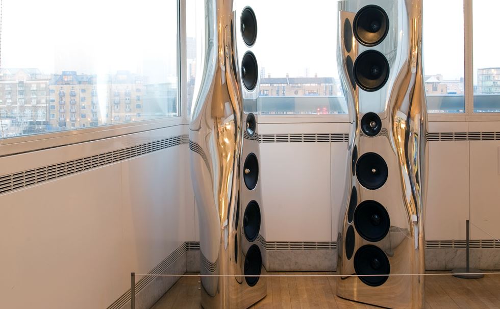
Ross Lovegrove’s speakers, made from solid blocks of aluminium
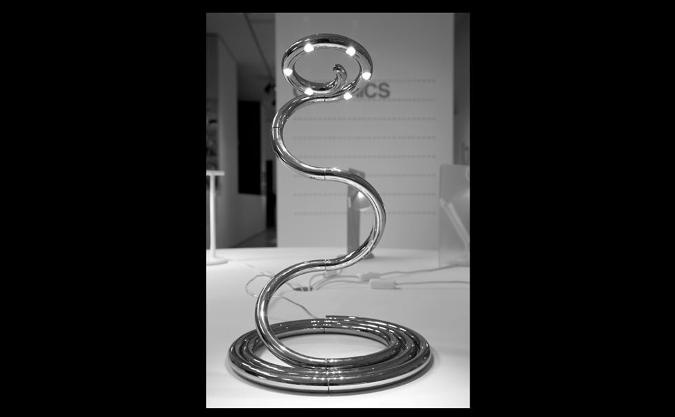
Ron Arad’s PizzaKobra lamp for Guzzini



A closer look at some of the other nominators, however, reveal a burgeoning interest in social engagement or in encouraging a greater civic awareness. The Clean City Law in São Paolo, for example, saw a near-total ban affecting billboards, digital signs and advertising, with the effect of refocusing attention on the public realm. The Velib bike-hire system for Paris was another striking example of civic-minded design that encourages communal sharing, and the concept has since been rolled out worldwide.
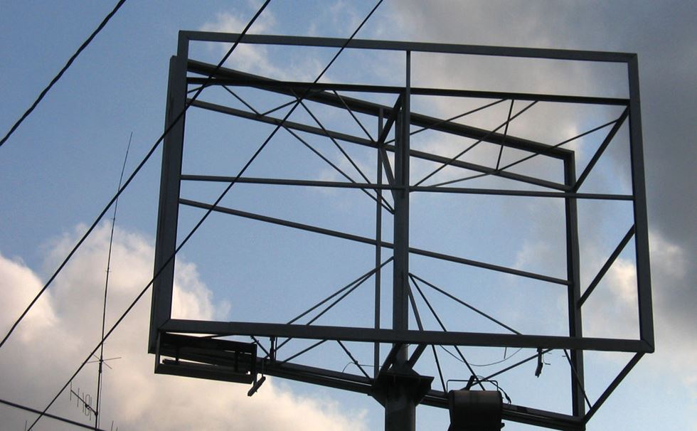
An empty billboard in São Paulo following the passing of the Clean City Law
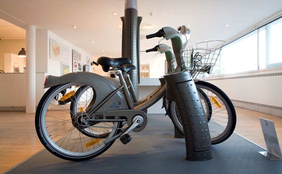
Velib bicycles on display in the gallery
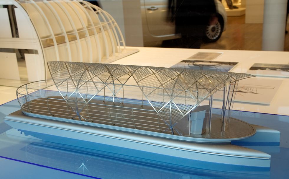
A model of the Serpentine Solar Shuttle, designed by Christoph Behling, Solar Lab Research and Design


In the Fashion category, Ma Ke’s powerful Wuyong (Useless) collection stood out for the way in which it celebrated local craftmanship in a particularly sensitive manner. The sense by which designers were starting to recognise local cultural value was also evident in Titus Nemeth’s Nassim typeface, which incorporated both Arabic and Roman alphabets (and now used by the BBC World Service). It’s particularly noticeable that, over the following years, several companies would start to develop typographic families that could support multiple languages – such as Nokia’s ‘Pure’ typeface, by Dalton Maag, (nominated in 2011), and the Google ‘Noto’ typeface (which was shown in Beazley Designs of the Year 2017).
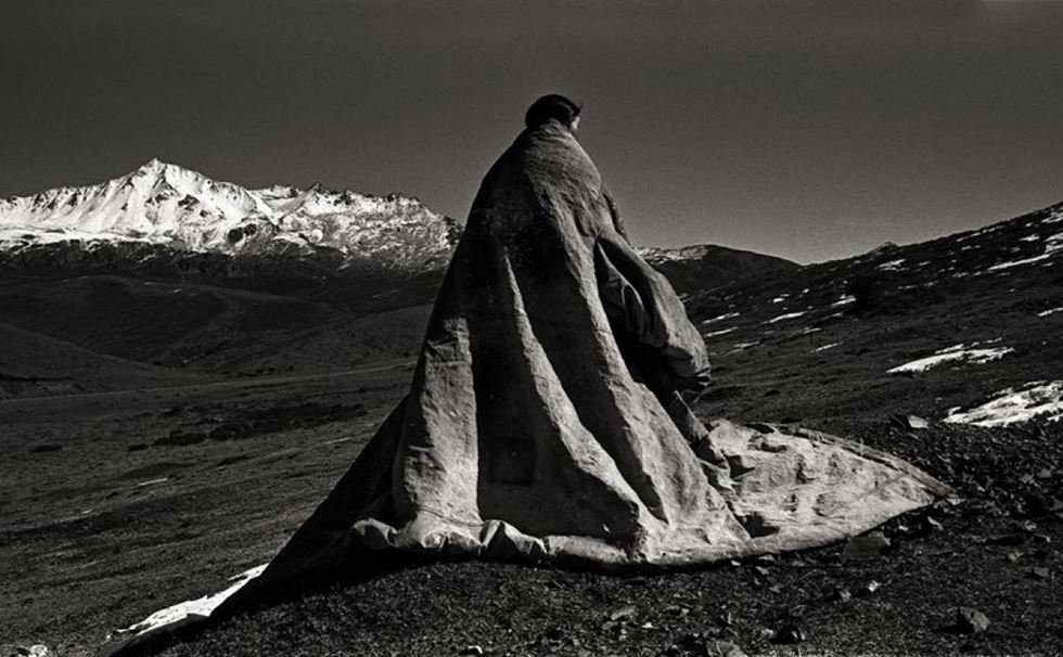
A piece from Ma Ke’s Wuyong collection, 2007

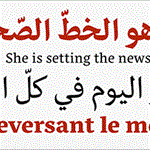
Titus Nemeth’s Nassim typeface, the first to incorporate both Arabic and Roman alphabets
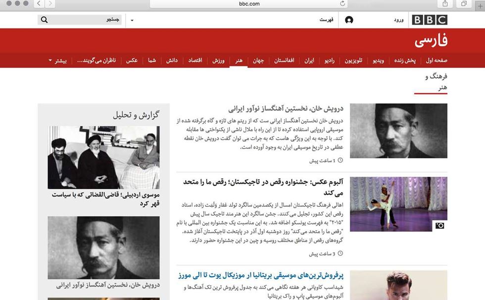
An adapted version of the Nassim typeface in use on the BBC World Service’s website


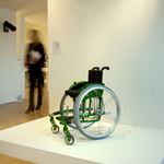
Other entries showed a pleasing recognition for the needs of those with disabilities. The Mex-X wheelchair by Meyra Ortopedia showed real awareness in designing for children, rather than giving kids adult-sized equipment (a trend which is, sadly, still common today). Perhaps the most understated object on show was the XL X-Beam ratcheting wrench, which looks perfectly ordinary at first glance. However, a closer look shows that the spanner is twisted by 90 degrees at its centre, which has the effect of dramatically increasing the amount of torque available when used. This has the effect relieving the stress on joints, which made the wrench the first hand tool to be approved by the American Arthritis Foundation.
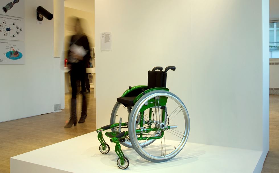
The Mex-X wheelchair by Meyra Ortopedia
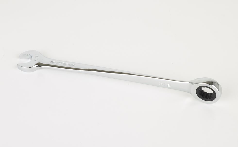
The XL X-Beam Ratcheting Wrench

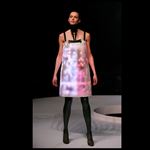
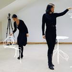
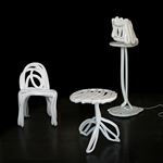
Technical innovation was popular then, as it continues to be today. Hussein Chalayan’s ‘Airbourne’ collection featured a crystal dress that flickered with 15,600 LED diodes, which impressed the judges so much that it was crowned the Fashion winner even though it was entered in the Interactive category. The aforementioned iPhone was included in the Digital category, as was Front Design’s astonishing Sketch collection, in which a sketch drawn in thin air was materialised as a finished piece of furniture, and which continues to astonish.
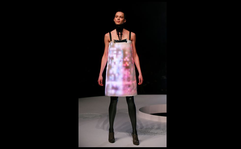
Hussein Chalayan’s Airbourne collection
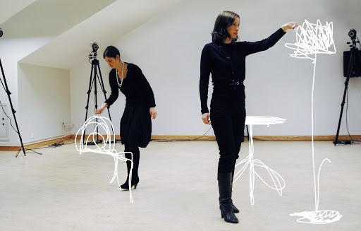
Front Design’s Sketch furniture
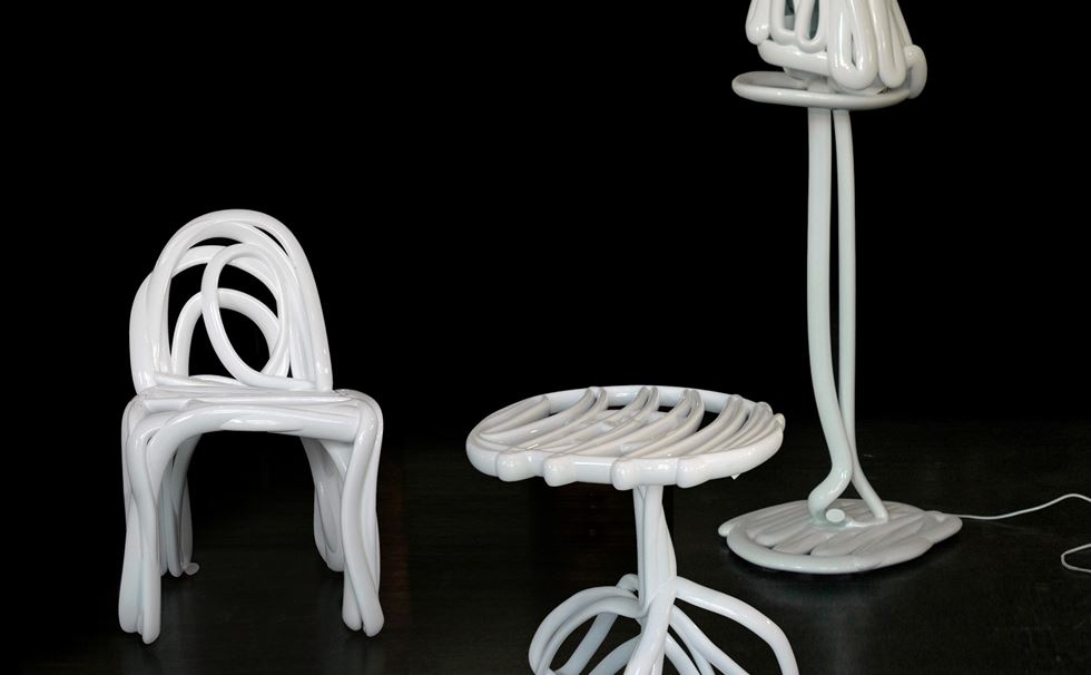
A Sketch chair in the Furniture gallery
Refreshingly, there were a number of designers who advocated a practical and more. playful approach to design – which came as a refreshing breath of fresh air. The winner of the Furniture category was Martino Gamper’s 100 Chairs in 100 Days project, in which he collected broken and abandoned chairs and reconstructed them into a brand new chair every day. Gamper’s Heath Robinson-esque approach to design can also be seen in Peter Marigold’s Make/Shift, a shelving system designed for frequent movers who often encounter difficulties adapting their existing furniture to new settings.
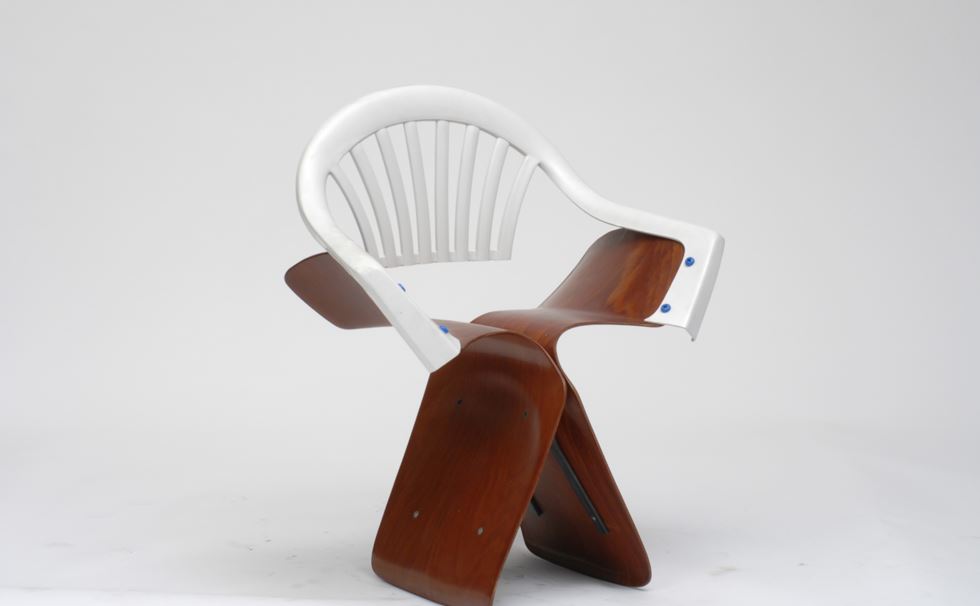
A striking chair from Martino Gamper’s 100 Chairs in 100 Days project
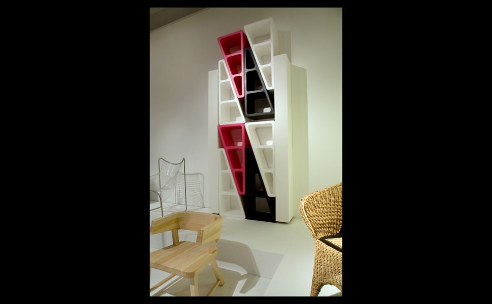
Peter Marigold’s Make/Shift adaptable shelving
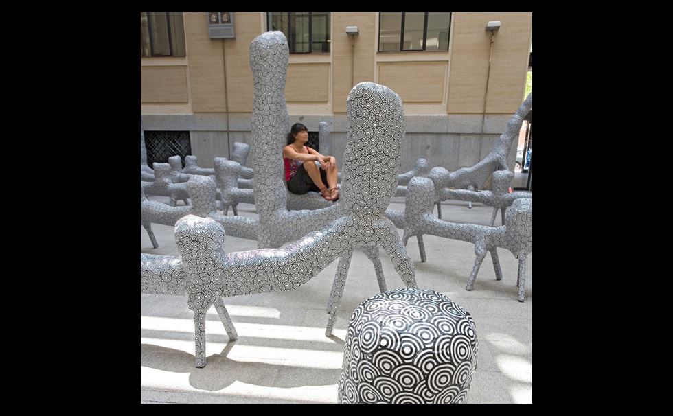
El Ultimo Grito’s ‘graffiti furniture’, created for the Casa Encendida in Madrid, made clever use of humble materials such as timber, bubble-wrap and shrinkwrap
Perhaps in recognition of the new, exuberant spirit in design, the Design Museum invited design collective OKAY Studio to create unique table centres for the awards ceremony. Mischievously, they created a number of centrepieces with the aim of encouraging food fights and foolishness. Oscar Narud created a dangerous-looking spoon catapult, while Peter Marigold made a tablecloth from which guests could hide from a food fight while taking on the guide of luminaires from the world of design. Jorre Van Ast invented a target for popping champagne corks. Shay Alkalay and Yael Mer, who work together as Raw Edges, adopted a medieval theme for their centrepieces, including a bow and arrow game using Italian bread sticks and apples, and a cream-shooting machine.
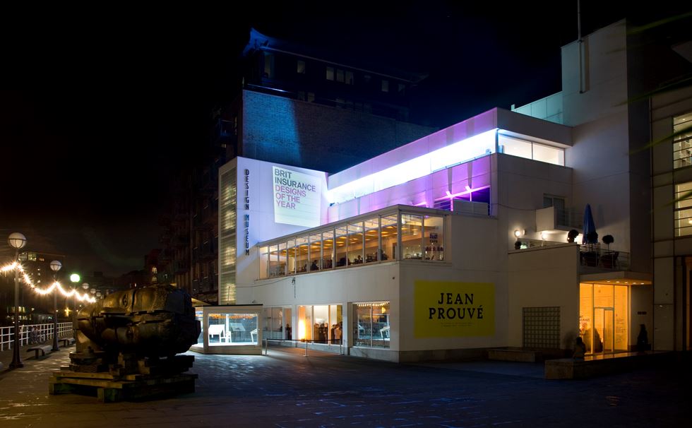
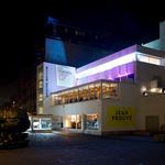
The awards night for the first Designs of the Year show, at the Design Museum’s Shad Thames home
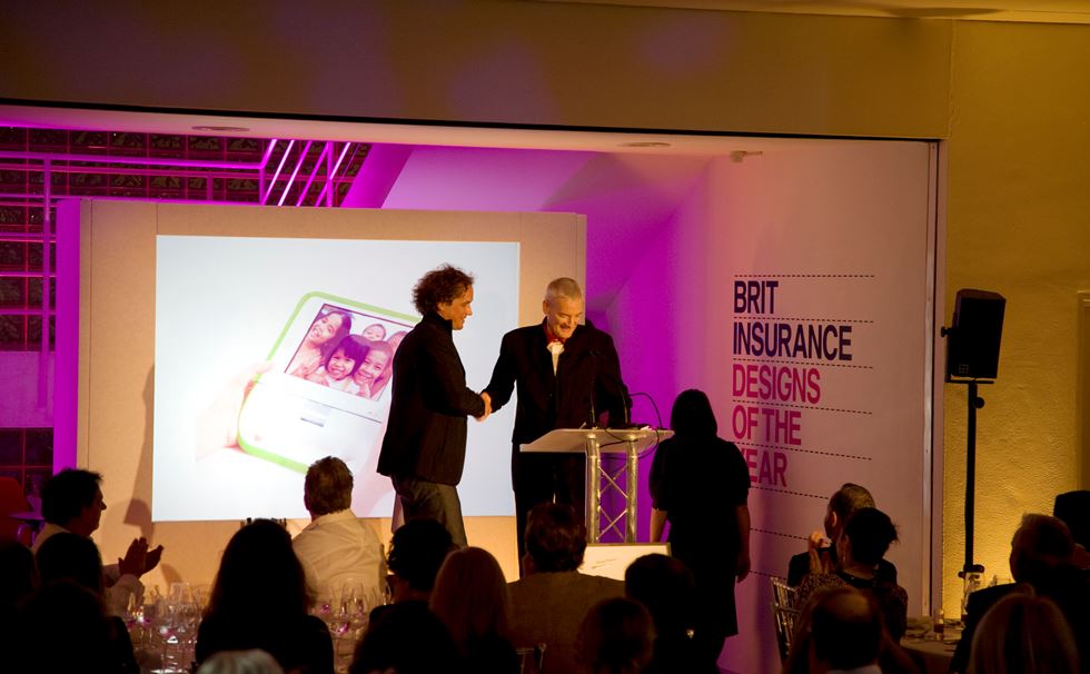
Yves Béhar accepting his award from Sir James Dyson
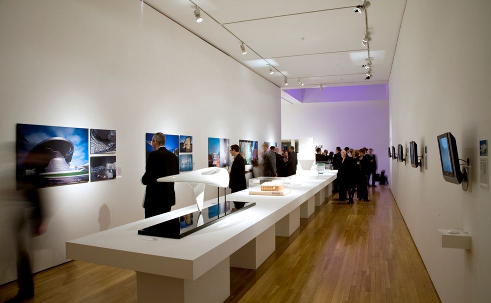
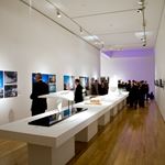
The exhibition private view

Unfortunately – or fortunately, depending on your point of view – the Design Museum no longer encourages food fights at its awards dinners. But the Beazley Designs of the Year exhibition continues to grow from strength to strength, and recent shows have been pleasingly diverse in their range – with nominations reflecting a desire to protect the environment, addressing the rise of artificial intelligence, or which aim to make the most of new material innovations.
public nominations
into the archive
Background image | The entrance to the first ever Designs of the Year show