Hope to Nope: Graphics and Politics 2008 - 2018
Q&A with Edel Rodriguez
To mark the Hope to Nope: Graphics and Politics 2008-2018 exhibition, the Design Museum speaks to Cuban-born visual artist, Edel Rodriguez.
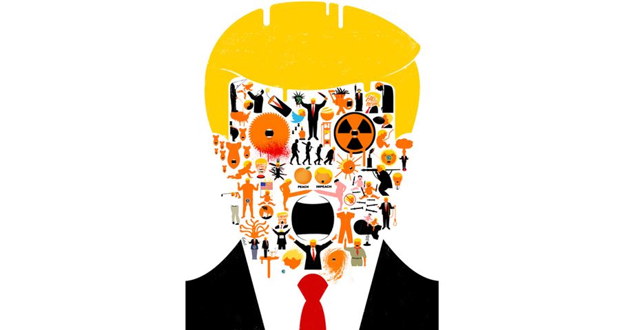
Edel's work, which can be found on display inside the exhibition, is endlessly inventive and full of wit. He has created numerous images of Donald Trump, including cover commissions for TIME, The New Yorker and Der Spiegel, and most recently designed an alternative (unofficial) cover for Micheal Wolff's Fire and Fury book.
Q:
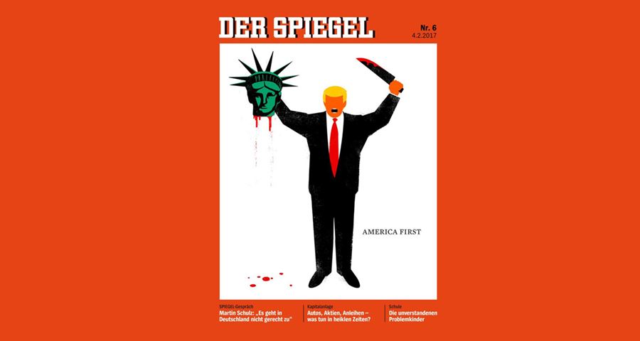
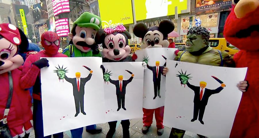
Your cover for Der Spiegel, which depicts Donald Trump beheading the Statue of Liberty, was in response to the Muslim ban. How did that come about?
Banning people from entering the country, based on their religion, is the behaviour of a dictatorship, it’s not what America should ever do. When the Muslim Ban was announced, family members were kept from one another, some inside the airport, and the others waiting outside. I was outraged. This is the kind of thing that the Cuban dictatorship had done to my family, toying with people’s lives, and their emotions. It was cruel and went against everything America had stood for in the past. I had a prior image that I had done of a terrorist with a knife, beheading himself, a comment on ISIS’s level of violence. As a reaction to the Muslim ban, I took the existing terrorist image and pasted Trump’s head on it, along with the beheaded statue on one hand, and the terrorist’s knife on the other. I wanted to compare him to an extremist who had killed the American dream. I posted the image online and it received a big reaction across my various social media feeds. A few days later, Der Spiegel magazine got in touch about creating a possible cover on the Muslim ban. I did a number of sketches but none of them were working for them. They saw the beheading image I had posted a few days earlier on my Twitter account and asked if they could run it on their cover. I made some minor revisions and they went ahead and published it. Before the magazine appeared on the newsstands, people around the globe began downloading the image from their Twitter feed and proceeded to start printing giant posters. The image appeared at multiple protests that night and for weeks to come, and led to many newspaper articles and television coverage.
Q:
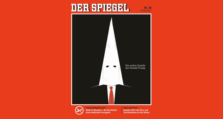
Your cover of Trump in a KKK hood for Der Spiegel has sparked a lot of controversy. Do you worry sometimes that you might be taking your work too far?
I created that cover of Trump in a KKK hood the week after he defended the actions of white supremacists and Neo nazis. I believe that racism and fascism must be confronted in a strong manner and that’s what I did. How far my work goes is all dependent on the timing. Like a boxer holding on to a punch, timing is the most important thing. I had that idea for a long time, with a suspicion that he held the beliefs of a racist, but I waited until the right moment to pounce. Finally, that week, the audience had come to terms with the idea that we had a racist as president.
Q:
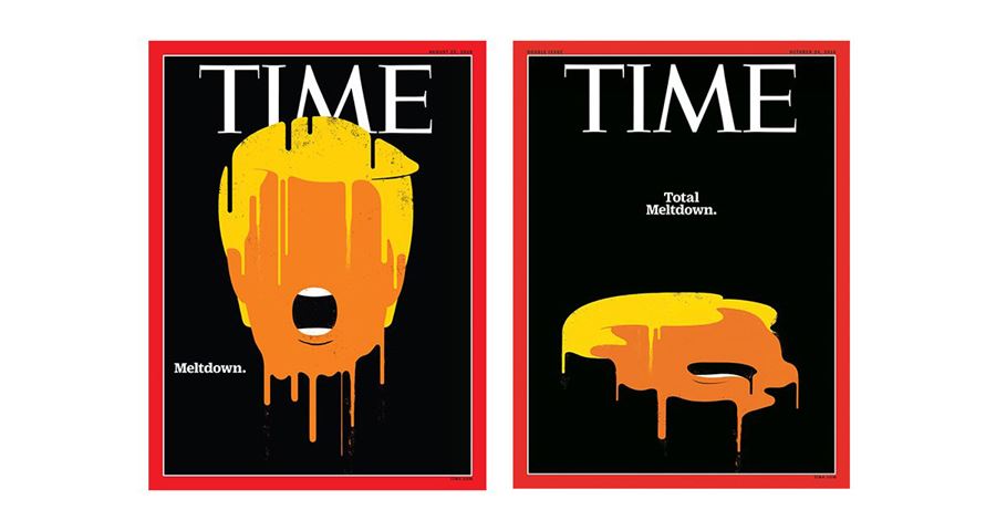
Why do you draw Trump with missing features?
I’m not interested in the details of his face, or his expressions. He is an object to me, an idea. He can become fire, a weighty mass, a blob, a knife, or any other object that affects our lives. If I were to put facial features, they would distract from the central idea I’m trying to get across. To me, the concept, the idea, and communicating that to the viewer, is the most important thing. Working in this manner, I’ve been able to establish a recognisable visage, a brand. Now I can do anything to that brand, stretch it, cut it, slice it, and people recognise it.
Q:
When you work on a commission for a big cover such as TIME, do you consider the wider impact it might have?
Yes, of course, that’s what I like about making magazine covers, knowing that millions, or, if you count the internet views and cable news coverage, perhaps billions of people are seeing my work.
Q:
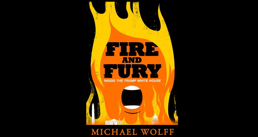
Your cover for Michael Wolff’s Fire and Fury exposé offers an alternative to Rick Pracher's original, which you called a missed opportunity for design, with its minimalist colour palette and serif fonts such as Union & Helvetica. Why do you think up until now the political genre has followed a more traditional style and do you think it is breaking from that mould?
The traditional approach is likely a sales gimmick. If a certain kind of looking book has sold in the past, for example, the political books by Bob Woodward, and those books have simple covers with a photo and serif type, then other publishers will follow the mould. It’s very common in every industry to just repeat what sells. That treatment also lends the book a historical air, and a bit of a neutrality as it pertains to the subject. More people, from all parties, are likely to buy it. I don’t believe in neutrality as it pertains to Trump. Neutrality normalises tyranny, populism, and fascism, there are many examples of this throughout history. It shouldn’t happen in America.
Q:
Your Fire and Fury alternative cover encouraged people to create their own artwork for the cover and sparked a Twitter campaign. Some people even swapped the original cover with yours on their Kindle devices. Were you surprised by this?
Yes, I was surprised by that. I’m always surprised by what people do with my work, from the way they bring it to protests to pasting it on their book covers. It’s a sign of people’s frustration with the media’s normalisation of this man. Someone who speaks of women the way he has, makes fun of prisoners of war and of handicapped people, attacks the parents of a dead soldier, amongst many other outrageous things, deserves zero deference from Americans. Everyone should speak up.
Q:
Take us through your thought process and design thinking when you approach a new project.
I follow the news regularly and constantly come up with ideas and sketches. When I receive an assignment, I start a new set of sketches based on the topic, or look through my past ideas to see if there is a right fit. My main focus is to be direct, honest in my beliefs, and to create something the audience has never seen, something that will shake their core, and something that will grab their attention. If I’m working on a magazine cover, I work back and forth with the art director and editor, via sketches, trying to figure out the right cropping and headline to get maximum impact. Once we’ve found a direction, I move forward with the final art. The whole process can take from one to three days.
Q:
Do you think the internet has changed the way that we consume information? How can newspaper and magazine design stay contemporary?
The single image, the strong, opinionated cover, has made quite a comeback because of the internet. Something as condensed and direct as a strong image is immediately shareable, it starts long conversations, creates discussions, and that’s what good magazine design should do. I think illustrations and graphics work well in the magazine cover format, because they stand out, from full size on newsstands, to small icons on one’s twitter feed. People are reacting to magazines with guts, periodicals that go out on a limb and say what many are thinking, hopefully we will continue to see more of that. If magazines can figure out how to translate what they do on their covers to the rest of their content I think they will continue to stay contemporary. Ease of use and ease of access is key.
Q:
Given the politically charged nature of your work, have you experienced any obstacles whilst working on or presenting your artwork?
Yes, I’ve experienced a few obstacles, and I’ve been shocked by it each time. A curator of an exhibition at a university invited me show a few of my magazine covers, but they were rejected by administrators higher up over a variety of supposed sensitivities, no clear reason was given. A liberal organisation asked me to do some work, but then backed out after Googling me, fearing that my work would bring them ramifications from conservative organisations. Others have delayed releasing some of my other work until the time is “proper”, because some stronger work was in the media. These are things I’m shocked to see in a democracy, where free speech is a cornerstone. How quickly some people succumb to institutional pressures, fearing reprisals from higher ups or from an audience is scary to me. It shouldn’t happen in this country, not even in a small instance, it is how we become what we fear. This type of censoring is fuel for me, it makes me get louder.
Q:
Do you think young people today are more politicised compared to previous generations?
I think many young people weren’t very politicised until the 2016 election and the recent shooting at Parkland High School. I’ve seen a huge surge. Young people had become accustomed to the inclusiveness and even tempered nature of Obama. After eight years, they thought that was normal. They were shocked into action by the election of Trump. The week before the election, I gave my students an assignment to create a political poster. Many didn’t want to do it, saying they weren’t interested in politics. The election took place, and the week after, only one student showed up to class. I asked where everyone was, and she said they were at the political rally in front of Trump tower. They saw that everything they took for granted—equality, women’s rights, gay rights, etc.—was being threatened, and became political. It’s great to see this kind of involvement in our youth. The students from Parkland are very courageous and inspiring.
Q:
The Hope to Nope exhibition is a retrospective of the last ten years in politics and graphic design. Which event do you remember the most from the past decade, which has left the most impact on you?
The events in Charlottesville, Virginia. I still get chills just thinking about it. We fought many years to defeat fascism, many American soldiers died in World War II. No American president should normalise fascism.
Q:
What’s the one thing you’d like people to remember about your work when they leave the Hope to Nope exhibition?
That I’m telling it like it is.
Q:
Finally, what advice would you give a young graphic designer starting today?
Speak your mind, your heart, your soul, the rest will follow.
Find out more