Hope to Nope: Graphics and Politics 2008 - 2018
Q&A with Shepard Fairey
To mark the Hope to Nope: Graphics and Politics 2008-2018 exhibition, the Design Museum's curator, Margaret Cubbage, speaks to American contemporary artist, Shepard Fairey
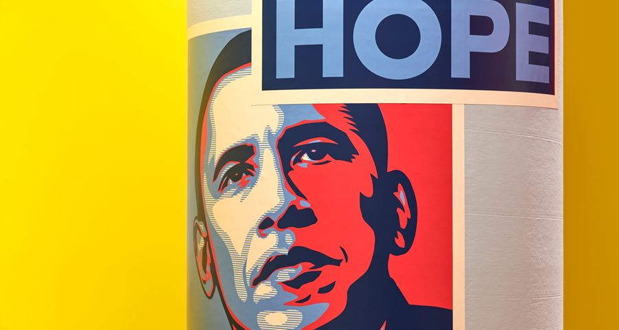
Fairey is a street artist, graphic designer, activist, illustrator and founder of OBEY Clothing who emerged from the skateboarding scene. He became widely known during the 2008 U.S. presidential election for his Barack Obama "Hope" poster.
This Q&A was done exclusively for the Hope to Nope: Graphics and politics 2008-18 catalogue.
Emerging from the punk and skateboarding scenes of the 1980s, Shepard Fairey has become one of the world’s most influential street artists. He trained in graphic design until 1992 at the Rhode Island School of Design, where he was known for his ‘Andre the Giant Has a Posse’ stencil, an effort that later evolved into the ‘Obey Giant’ sticker – which immediately went viral on walls and street signs across the world. Best known for his 2008 ‘Hope’ poster for then-candidate Barack Obama, a tool of grass-roots activism which won the Design Museum’s Design of the Year in 2009, Fairey’s work has appeared repeatedly on the streets and online over the past decade, particularly during moments of intense political struggle. From free downloadable posters to murals on 15-storey buildings, Fairey provokes and inspires with works addressing climate change, income inequality, sexism, racism and immigration. In 2017, Obey Giant – a documentary produced by film-maker James Moll, philanthropist Jennifer Howell and actor James Franco – was released to critical acclaim, chronicling Fairey’s improbable career. Fairey ended 2017 with ‘Damaged’, his largest exhibition to date, in his home town of Los Angeles.
Q:
What has been your most important work?
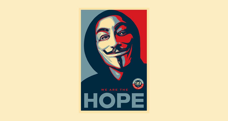
Every piece I make is important to me, but in terms of broader significance the various works that I did to support Barack Obama – ‘Hope’, ‘Change’ and ‘Vote’ – made an impact during that campaign cycle. Then my subversion of the ‘Hope’ poster using the Occupy protestor in the Guy Fawkes mask, and my protestor illustration that depicted the TIME magazine Person of the Year cover in 2011, were reference points for Occupy. The ‘Earth Crisis’ globe installation at the Eiffel Tower, coinciding with the UN Climate Change Conference in 2015 (COP 21), and the related images for my ‘Earth Crisis’ art show hopefully made an impact, too, not only on people already interested in environmental responsibility, but also on others who may not have been as well informed. More recently, I think the ‘We The People’ posters for the US Presidential Inauguration and the 2017 Women’s March – as well as the additional fine art and activism-oriented iterations of those pieces – have been influential.
Q:
Although you are known as an artist, your background is in graphic design. Does visual communication actually change minds?
I do think that it can change minds. I think the evolution of the peace sign, for example, from an underground symbol of opposition to nuclear proliferation, to a broader cultural symbol of opposition to the Vietnam war, and finally to being embraced by fashion and pop culture, had changed attitudes about the Vietnam war. Most political imagery for mainstream candidates exists in a very safe and predictable zone, which tends to be more about avoiding controversy than inspiring change. I was lucky with the ‘Hope’ poster, in that it was different enough yet also safe enough. A lot of art dealing with social issues can be influential, but it is usually work that was created outside the system. I frequently reference work such as Barbara Kruger’s ‘Untitled (Your Body is a Battleground)’, an image embraced by reproductive rights activists, and Robbie Conal’s ‘Contra Diction’, critiquing Ronald Reagan, as works that were not only influential in general, but also very influential for me. The thing about good art and design is that they can impact people emotionally and get past the barriers of their pre-existing biases.
Q:
Why did you create the Obama ‘Hope’ poster? What was it that you felt Obama’s campaign needed?
I was impressed with both Obama’s policy positions and his skills as an orator that seemed linked to genuine humanity and strength of character. I felt Obama could be a transformative figure and that his success could open the door to progressive policies I wanted to see implemented. I felt Obama’s biggest challenges were not being well established and not being white. In creating a poster that represented him as having a vision, with a stylised and idealised treatment, in a red, white and blue colour combination, I felt I could implicitly portray Obama as established enough to be worthy of an idealised portrait, almost like a two-dimensional statue – patriotic and American rather than being of any specific race.
Q:
How do you feel about the many imitations and subversions of that poster? You subverted it yourself for ‘Occupy’, but how do you react when others put a different spin on your art?
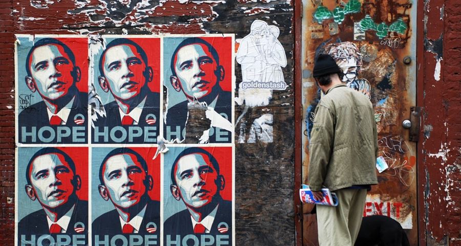
Whether something that riffs off the ‘Hope’ poster is an homage or a parody, whether it is philosophically aligned or dissenting, I’m happy to see the images reference something that I created on a low budget as someone with very little political power relative to people from the corporate world or the political establishment. The ubiquity of the ‘Hope’ image demonstrates that grass-roots activism makes a difference and that none of us are powerless.
Q:
Digital tools and the rise of social media have made graphic messaging much more accessible. How do you think this has changed the dynamic of political iconography? Are you nostalgic for the days before concepts such as going viral?
Even before the Internet, I was making images with the mindset that people have a lot of visual noise in their lives, so my work needs to be instant and memorable, easy to replicate and, even in an analogue world, potentially viral. Digital tools and social media mean that more people are empowered, but there are also white noise and mediocre graphics and memes bouncing around. I utilise the same principles that I always have when I transmit my work digitally; I want it to be instantly memorable, evocative, and graphically and emotionally potent. Digital tools have in some ways helped activism, but in other ways they have resulted in people doing things that are merely convenient and symbolic only for them. It is not necessarily meaningful in terms of how they participate in effecting change.
Q:
Your work still has a physical presence in the streets. How important is the physical artefact today?
One of the reasons doing work on the street is still very important to me is that it demonstrates my commitment to actions in the real world, not just in the digital realm. I think that the obvious work that goes into a street mural imbues the imagery with an added layer of acknowledged commitment, and reminds the viewer that changing things in the real world takes work.
Q:
What is your advice for younger artists and designers who want to create political work?
First, do enough homework about the cause to really know the most potent and accurate symbols that might be used to represent it. Next, make something that conveys the idea of the cause quickly, in an understandable and relatable way.
Last, it’s important to communicate with people who run organisations or are allies who can help to disseminate and perpetuate the imagery. When people see something popping up in multiple places, it’s natural that they become curious and intuitively see the point of view of the image as more legitimate.
Q:
What other political artists or designers inspire you?
I like what JR is doing a lot. Banksy, of course. Also Swoon. I like what Ernesto Yerena is creating. Barbara Kruger and Robbie Conal, for sure. And Edel Rodriguez is doing some compelling magazine covers and other inspiring design work.
Q:
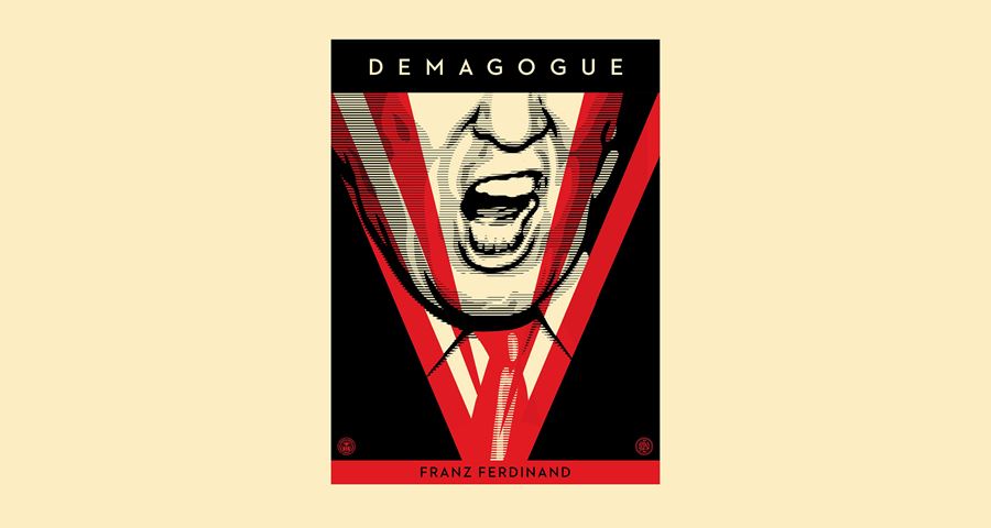
Donald Trump became an instant graphic caricature. What do you think about how Trump is portrayed? Would you ever reference him directly in your work?
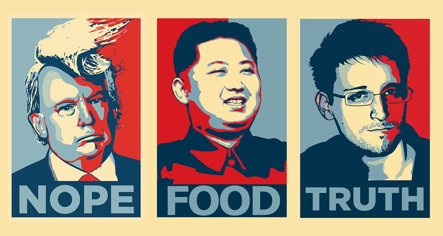
I did when I collaborated with the band Franz Ferdinand on the art for their song ‘Demagogue’. I portrayed Trump as a Big Brother-esque face on a video screen with spotlights; the image only shows his nose, contorted mouth and red tie, yet I think it is still instantly recognisable. I haven’t created other images of Trump because I think he’s already a caricature and he only seems to gain more power from more attention, even when the attention is negative. I really don’t want to deal with Trump down in the mud at his level.
Q:
What does ‘Hope’ mean to you now?
As far as the ‘Hope’ poster goes, I hope it’s a reminder to people that it is possible to have an intelligent, articulate and dignified person in the White House. What I am hopeful for now is that the sting of the current administration will awaken and activate people who have been complacent and indifferent. A lot of the imagery around women’s rights and immigration issues has been beautiful, powerful and hopeful.
Find out more